Branding is difficult, especially when it comes to the cannabis industry. Not only do you have to determine your core values and target audience, but you also have to come up with a catchy name and visually arresting aesthetic to catch the eyes of potential customers. If you’re like most cannabis brands, then the temptation to implement a cannabis leaf or the word “canna” into your branding is pretty strong; but don’t do it!
It may be tempting to have your canna-brand covered in cannabis leaves, but it’s not 1996 anymore. If you want your cannabis company to stand out from the crowd, you’re going to have to ditch the canna-clichés and get with the times. Here are three reasons why:
There’s too many
Off the top of your head, how many cannabis brands can you name with the word “canna” in it? Five? Ten? Twenty? If you take more than a few seconds, odds are you’ll be able to name at least a few. Likewise, if you sit down and try to think of all of the companies with cannabis leaves in their logo, you’ll probably be sitting there for a minute or two.
According to a write-up from Slate, nearly half (44.1%) of all cannabis companies implement cannabis leaves into their logo. That is a shamefully high number. If you want your cannabis brand to look like any other company out there, the surest way is to weave in a cannabis leaf into your logo.
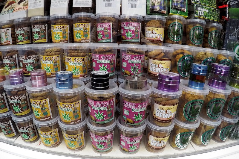
The entire point of branding is distinguishing yourself from your competitors, not blend in with them. That means you’re going to think of a color scheme other than green, a logo that doesn’t have a cannabis leaf and avoid any brand name that contains the terms canna, jane, mary, or any other play off the word cannabis.
Take MedMen, for example.
They are one of the largest cannabis dispensary chains in the United States, and nowhere in the logo is there a cannabis leaf. Their color scheme is based around red, not green. Most importantly, their name is not a pun off of the word cannabis or marijuana. Instead of embracing the clichés around cannabis, MedMen forged their own identity, and as a result, are doing quite well.
Canna-Clichés Lack Sophistication
As the cannabis industry matures, so too does its users. At one point in time, cannabis users were merely happy that they could go to a dispensary; but now their needs have become more sophisticated. They don’t want to visit a store or purchase a cannabis product with names like “Stanky Budz 420.”
The cannabis industry is no longer an industry for white, college-aged men; cannabis is for everyone. If you want to resonate with your target market, you have to step up your game. To that end, you will have to a little out of the box thinking.
Ask yourself who you want to sell your products to, think about the kinds of products this theoretical person would buy, and then take a look at some of the brands on the market. You don’t have to copy everything these brands are doing necessarily, but they will help provide you with a roadmap for your own branding journey.
One cannabis company that excels at sophisticated branding is Whoopi & Maya, a cannabis brand aimed at women suffering from menstrual cramps.
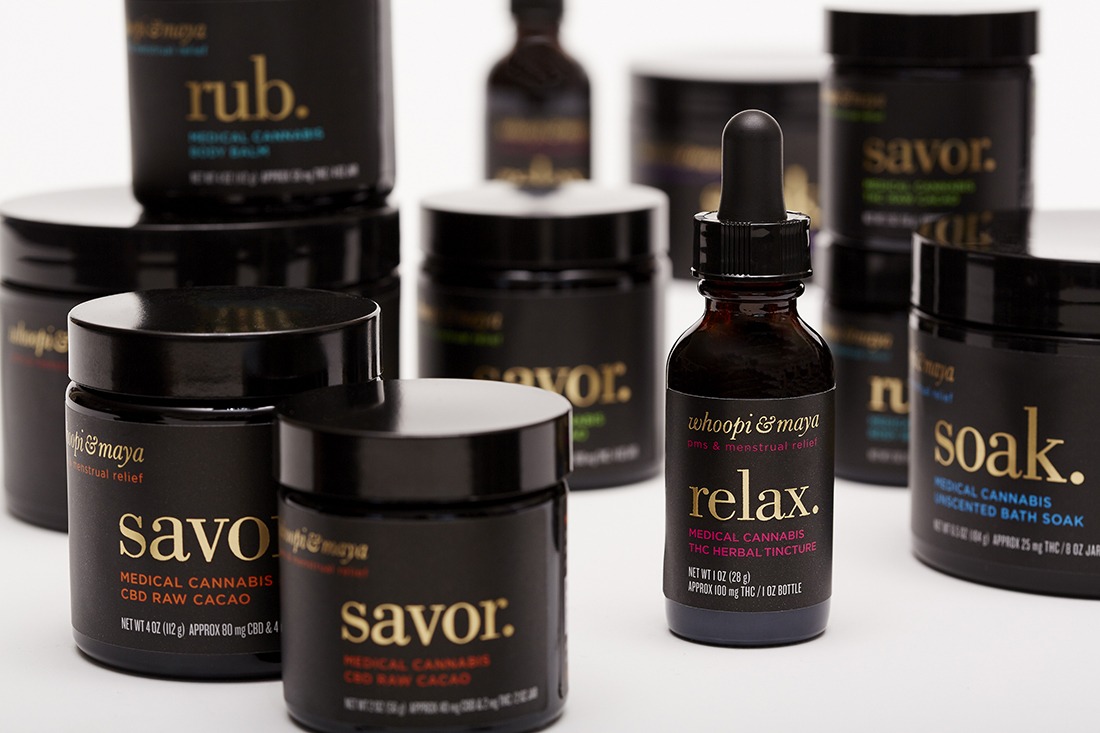
If you were to take a look at the packaging for Whoopi & Maya, you might not know that it’s a cannabis brand at first glance. With a sleek black background and silky serif font, the products look like they belong on the beauty and wellness isle more than they do in a cannabis dispensary. That is not by accident.
Take a look at the cosmetic line belif.
Although both brands appear unique enough to distinguish themselves, both brands use similar design elements; serif font, lower case lettering, minimalistic labeling, etc. Neither brand is trying to copy one another, but they are trying to sell to the same consumer.
The Cannabis Leaf is Hard to Advertise
Aside from the fact that customers respond to canna-clichés negatively, it is also harder to advertise them. In many of the places where adult-use cannabis is legal, from Canada to various U.S. states, the laws are written as such to where both packaging and advertising laws are quite strict.
When most of these packaging and advertising laws were written for the cannabis industry, legislators took pains to stifle as many of these canna-clichés as possible. You can’t use cartoon characters. You can’t use overtly flashy labeling. You can’t make medical claims. You can’t slap cannabis leaves on billboards.
On the digital side of the equation, it is even more critical to avoid clichés. Although Facebook and Google have taken a hard stance on cannabis-related advertisements, ancillary companies that avoid using cannabis leaves or cannabis references in their name can often make it through the ad approval process.
Even if you’re using a secondary ad network that fully allows cannabis ads, avoiding stereotypical stoner language and imagery is the best way to ensure that your ads are seen by the broadest audience possible. Any kind of ad filled with half-naked women, cannabis leaves, and poorly drawn characters will almost always get rejected; no matter how lenient the platform.
By falling into the tired and unoriginal, not only are you limiting yourself creatively, but you’re also limiting yourself commercially. By creating a brand that is not only smart but also aesthetically pleasing, you make your brand more palatable; which in turn makes your brand more visible.
Tips for Elevating Your Cannabis Brand
Implement a Style Guide – One of the most critical concepts in branding is consistency. If you are not consistently implementing your branding every single time, your brand recognition and value diminishes. That is why it is paramount that you implement a style guide.
A style guide is essentially a rulebook that ensures that you always use the same design elements in your branding; from the color palette to font. Typically, you’ll want to limit your palette to just three colors, and you want to be sure that your font compliments those colors. By abiding by your style guide, you help give your brand cohesion and an air of legitimacy.
Research Other Brands – If you’re feeling a little lost, researching other brands can help you find your inspiration. Look for brands in other industries that market to your target audience and take note of what they’re doing. What kind of colors do they like to use? What kind of language do they use? How do they design their packaging? You don’t need to copy these brands necessarily, just take inspiration from their design elements.
It also pays to research your competitors. Ask yourself what you like and dislike about their branding. Is there a recurring theme among all of your competitors? Figure out where you stand out and lean into it.
Seek Out the Professionals – Most people like to think of themselves as a jack-of-all-trades and a master of everything. But the sad truth is that most of us are only good at a handful of things, and there’s nothing wrong with that! One of the best ways to elevate your branding is to seek out the help of a professional branding company, like Wick & Mortar.
One of the advantages of using a cannabis branding agency is that you can avoid many of the canna-clichés discussed in today’s post. There are teams of seasoned professionals with years of experience that you can turn to for advice for everything; from logos to brand implementation. Even if you’ve gotten most of your branding figured out, a little help here and there never hurts.