In a market that is bringing new products to the shelves daily, package design can make or break a brand. Whether it’s considering the use of color, typography, illustration, or the actual construction of the package itself – There are 42 brands that we believe are a step above the rest when it comes to package design.
1. DOSE
Boasting an eye-catching palette of bright neons, Dose’s packaging of its vapor oil is enticing, exciting, and tantalizing. The high contrast design of bright tones against a stark black box catches the eye of even the most indecisive consumer.
![]()
2. LOLA
Lola has succeeded with flying colors at infusing depth and meaning to its beautiful packaging design. The eccentric colors of the box paired with the sleekness of the glass container enclosed inside is beautiful.

3. LEGAL BEVERAGES BY MIRTH PROVISIONS
Holding a bottle of Legal Beverages will definitely act as a conversation starter. It oozes of masculine identity – Its cool amber glass bottle wrapped in a dark label donning flashy metallic accents. Sassy, bold, and provocative, their design packs a punch.
![]()
4. FORIA PLEASURE
Since coming to the market, Foria has captivated consumers with its sexy, alluring design. It inspires a certain seduction using only black velvet and gold foil that pairs well the herbal formula inside.
![]()
5. THE GOOD SHIP
How fun and modern are the Good Ship packaged products? The design’s carefully calculated use of white space sets the foundation for a cool crisp design identity. We’re loving the gold accents layered over a playful color palette.
![]()
6. HOUDINI
Houdini’s packaging is just that – enchanting.Their color palette builds on its strong conceptual execution with a cool desaturated fade. Its unique multidimensional design brings the consumer inward with a full interior galaxy wrap to focus the eye on the product inside.

7. MADAME MUNCHIES
When a box of Madame Munchies is in your hands, it has a majestic feeling that we can’t really put into words. The soft velvet feel of its dark navy box falls into the background as the gold foil design pops to the forefront.
![]()
8. M BOX BY CLUB M
It’s no surprise that we are loving the use of gold accents and Club M’s application of them is nothing less than impressive. The box’s heavy weight demands attention as you find yourself tracing your fingers along its embossed golden grooves.
![]()
9. DÉFONCÉ CHOCOLATES
Défoncé’s chocolate boxes are nothing short of extraordinary. Their application of a laminated pattern banded over a single color sleeve gives it a feminine touch while the deep black of the box is most certainly masculine.
![]()
10. HMBLDT
What an interesting way to give a retro feeling to a product line! Their carefully selected color palette of warm desaturated tones lends to its cohesive appeal when viewed as an entire set. Even their conscious choice of using lowercase typography throughout their design blends well with their overall aesthetic.
![]()
11. HERMETIC GENETICS
Boasting a design using only monochromatic tones gives their packaging a rustic, ‘hands in the soil’ kind of feel and we’re loving it. Their use of aluminum cans and plastic bags is unexpected, yet well-executed.
![]()
12. WINTERLIFE
Wow! Winterlife’s use of billowing typography as a graphic element is spicy! Pair their simple bottle design with beautiful photography and you’ve got a product that POPS!
![]()
13. LOWELL HERB CO.
Lowell Herb Co.’s packaging design successfully captures a soft, down-to-Earth farmer’s market vibe. Wrapped in faded brown paper and tied up with twine – We can’t help but feel like each of these products has an effortless and personalized feel.
![]()
14. SUNCLIFF
Creative, calm, social… Suncliff’s bright color palette of rich pastels popping off a crisp white backdrop is beautiful and serene. What we may love even more is the bold black and white geometric design that’s tucked into the side of the package.
![]()
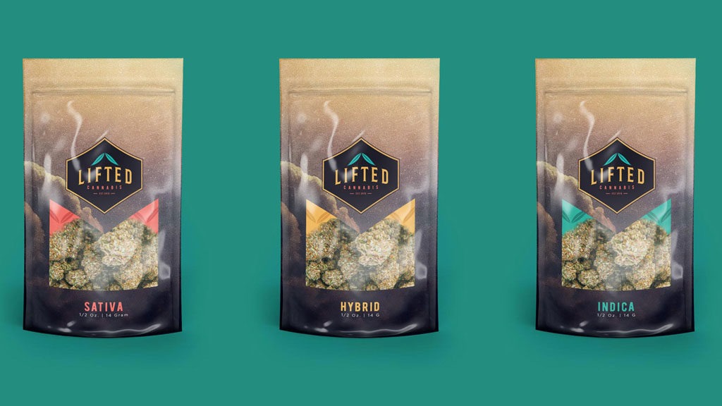
15. LIFTED
As a series, Lifted’s design has a strong aesthetic that we’re really drawn to. The grainy texture of neutrals cuts in to reveal its premium product with a striking contrast against the red inside detail. The shapes are sharp, delierate, and bold!
16. AYA BY SONOMA CANNABIS CO.
Beautiful and majestic – If we had to choose two words to describe AYA’s packaging solution, we’d have to go with that. Its design took the road less traveled and paired a variety of imagery, outlines, patterns, and textures to entice a consumer to pick it up and learn more.
![]()
17. KANNAKRILL FOR PETS
Kannakrill’s packaging utilizes simple, yet effective elements in their design approach. The flat design of silhouettes against large blocks of color allows the metallic-foiled cannabis leaves to make a statement.
![]()
18. CANNAVORE
Embracing a simplistic, yet elegant look – Cannavore made a smart choice with it came to their package design. Their use of typography, pattern, and hierarchy of elements lends to a very pleasing design that looks rich.
![]()
19. MARIGOLD SWEETS
Marigold Sweets may have the most beautiful presentation we have yet to see in the market. Their package design is focused on the presentation of what’s inside which is interesting, provocative, and genius.
![]()
20. REBEL SPIRIT
Wielding an intense dedication to its demographic, Rebel Spirit has succeeded at catering their design to a niche. Their choice of design elements – typography, color palette, and texture – emits an emotion that resonates with their consumer. It’s wild, raw, and spirited!
![]()
21. KIVA CONFECTIONS
Kiva has long captivated consumers with the package designs of their products. Their ability to apply simple, largely typographic elements, and yet still maintain a cherished, luxe feel is fantastic. Their chocolate bars are wrapped in a grainy cardboard sleeve printed with ink that sinks into the paper.
![]()
22. QUILL
Quill’s packaging solution looks like we should find it at an art exhibit. On the outside, they’ve decided to only use black and white – a bold decision, well executed with its handdrawn type. However, once you interact with the product and open it up, you are greeted with an unexpected mural of abstract colorful watercolor elements.
![]()
23. WYLD
Wyld takes packaging one step further by surprising the consumer with architecture, rather than focusing only on color. Its geometric design allows Wyld more packaging ‘real estate’ to educate about the product while positioning their beautiful logo front and center.
![]()
24. LEAFS BY SNOOP
We love the unexpected and Leafs By Snoop exceeds one’s wildest dreams with its packaging aesthetic. Capturing attention with the cool white velvet feel of its box, it slips up to reveal a wild illustration that wraps around all four sides. It’s creative and irreverently elegant.
![]()
25. STILLWATER
Infusing the colors one would see streaking the sky at sunset, Stillwater packaging design is just that – breathtaking. It’s serene, peaceful, and simple – They are only using one color per product featuring bold white typographic elements and education.
![]()
26. POT BOX
There is something about using natural textures that infuses a certain energy into a packaging design. Pot Box went above and beyond in employing that energy by bottling their products in heavy glass containers sealed with soft cork toppers and slick red wax.
![]()
27. AUNTIE DOLORES
Savoring simplicity and elegance, Auntie Dolores utilized its signature script typography to give its products a familiar, homemade feel. They’re not looking to overwhelm their consumer with a flashy design, but instead remind them of something already in their pantry.
![]()
28. APOTHECANNA
Apothecanna’s use of typography and one-color packaging design is brilliant. The titles of their products push and pull from the white background, making for an energetic visual interaction.
![]()
29. MARLEY NATURAL
Marley Natural’s made an incredibly smart decision in defining their product aesthetic – They made a bold move and redefined the Rastafari feel. Their decision to us Neville Garrick the artist, a personal friend of Bob Marley’s, allows them to both resonate with the culture while adding a personal touch.

30. DADDY FAT SACKS
It’s vulgar, it’s bright, and it’s absurdly eye-catching. Daddy Fat Sacks package design is one-of-a-kind and we haven’t seen anything quite like it. Their use of large blocks of color, overlapping elements, and happy-go-lucky typography is delightful.

31. WHOOPI & MAYA
It feels luxe and it speaks to our deepest feminine desires. Whoopi & Maya have successfully combined both cool and warm tones against a matte black label to initiate a conversation with our intuition.
![]()
32. SIMETRA
Reminiscent of age-old apothecary bottles, Simetra has successfully updated an ancient design for the modern age. The warm gold tones of the typography and label cozy up against the amber colored glass. Something else we love? The frayed twine wrapped around the neck of the bottle with a woodgrain tag.
![]()
33. JOLLYBEE
JollyBee’s extracts takes full advantage of a branding opportunity to create unique packaging for its products. The hexagon shape of its containers houses extract molded into the shape of a bee – Genius. Despite the small size of their product, their design is largely impressive.
![]()
34. MARY’S MEDICINALS
Black, white, and pinstriped typography – Those are the three core elements that draw us to Mary’s Medicinals packaging design. Their typography is wild and varied, yet stays grounded with its use of only the most basic of colors and elements.

35. BLOOM FARMS
Bloom Farms has an elevated, sleek approach to its package design. They keep it simple and refreshing while attaining this sexiness we can’t quite put our finger on. They vary their use of metallic accents around their products, but still uphold a consistent aesthetic.
![]()
36. HASHMAN INFUSED
Elicit shades of reds create an alluring geometric pattern on Hashman Infused’s packaging. Its design is balanced with clear hierarchy, but its layered elements make it almost vibrational. What is even more exciting is how well the outside design echoes the geometric chocolate disk inside.

37. SKUNK
Utilizing gradients in design is a tricky feat, but Skunk has effortlessly nailed it in terms of application. Its cool color palette of pastels is soft, while the box’s architecture is crisp and sharp. We love the contrast, energy, and on-brand design.

38. WILDFIRE CRAFT CANNABIS
Wildlife’s packaging is dark, sultry, and mischievous. Their choice to use an overwhelming amount of black inked pattern on black background is aggressive, though it translates incredibly well with the pop of the red and orange of the logo.

39. LORD JONES
Reminiscent of a Juicy Couture or Hermes, Lord Jones has impressively aligned itself with other high-end brands all thanks to its design choices. Regal illustrations in black ink against a solid backdrop gives it a traditional feel. However, with carefully placed rich golden accents, it elevates the product to a whole new level.

40. SPRANKLES
Fun, modern, and incredibly engaging, Sprankles’ packaging is one to bookmark. The placement of the fingers is beautifully instructing the consumer on how to use the product inside, while also leading the eye to the logo itself. Brilliantly engaging.

41. HI.
We can’t help but smile when it comes to hi’s packaging concept. Like we’ve seen above, they use a single color per package paired with white typography which keeps it simple. However, what makes us love the design is their unique illustrations for each of their lines – soothe, passion, relax, etc. They create a cohesive brand that’s friendly and easy for the most inexperienced consumer to comprehend.

42. LEAPH
Fulfilling our need for vibrancy and conversation, Leaph’s product design is a powerful solution. It leaves a deep impression on the consumer with its use of illustration as the main component of the design. It’s colorful, groundbreaking, and captivating and will no doubt be a favorite on the dispensary shelf.
![]()
BLOGGING
It takes time and resources to write posts consistently (trust us, we know). At the end of the day you’ll not only be ranking higher in search engines, but be building your brand and positioning yourself as an industry expert. Try to find time to post around 3 articles a week as this will massively improve the traffic to your site – and ultimately your storefront.
VALUE PROPOSITION (STORY)
No, it won’t write itself. And yes, it will help your business grow. Value propositions are a short summation of the solution your company provides, and why the potential customer should get it from you.
Not only will this immediately convey your message to your users, but will help you define who you are as a brand and why the market should pay attention to YOU.
Learn how to effectively write a value proposition.
GOOGLE ANALYTICS
Why? Because numbers matter. Setting up Google Analytics (or similar software) will allow you to see what’s working, and what’s not. It allows you to connect with your users (and customers) by inferring their feelings based on the actions they take on your website.
People are jumping off your page as soon as they arrive? Okay, better test a new structure and CTA above the fold.
It’s high time you start treating your website as your online storefront – with customer service to boot. After all, they are your potential customers and fans, right?