In an increasingly crowded industry like cannabis, it can be difficult to distinguish yourself. With thousands of different dispensaries out there, having a sharp logo and a nice website just won’t cut it. Especially if you find yourself competing with multi-state operators with millions of dollars to draw upon! The best way to set yourself out from the crowd is to focus on a dispensary design that stimulates the senses. But the question is, how do you do it?
Six Tips for Boosting Dispensary Design
1. Open Floor Plan
One of the most integral parts of good cannabis design is creating a space where your customers feel comfortable. For many cannabis consumers, especially first-time customers, visiting a cannabis dispensary can be an uneasy experience. Part of that unease comes from the legacy of prohibition, but a larger part of their discomfort comes from the cramped layouts that some dispensaries implement. If you want to create an enjoyable dispensary experience, then an open floor plan may be exactly what you need.
The dispensary Paper & Leaf in Bainbridge Island, Washington is a good example.
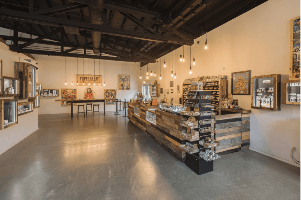
The store itself is not necessarily large when compared to other retail stores, but it feels much bigger because their display products line the walls instead of cluttering the middle. The one piece of furniture in the dispensary is aligned symmetrically with the wall decorations and the lights. You don’t necessarily have to copy these design elements precisely, but remember the importance of maintaining a clutter-free and balanced retail space.
2. Consider Your Ambiance
The best dispensaries are the ones that take into account the ambiance of their store, particularly as it relates to branding. The atmosphere and character of your store should match both your branding and your target demographic. If your dispensary ambiance does not match your branding or audience, you run the risk of both turning away potential customers and harming your brand’s image.
A great example of good cannabis design is the Portland, Oregon dispensary Farma.
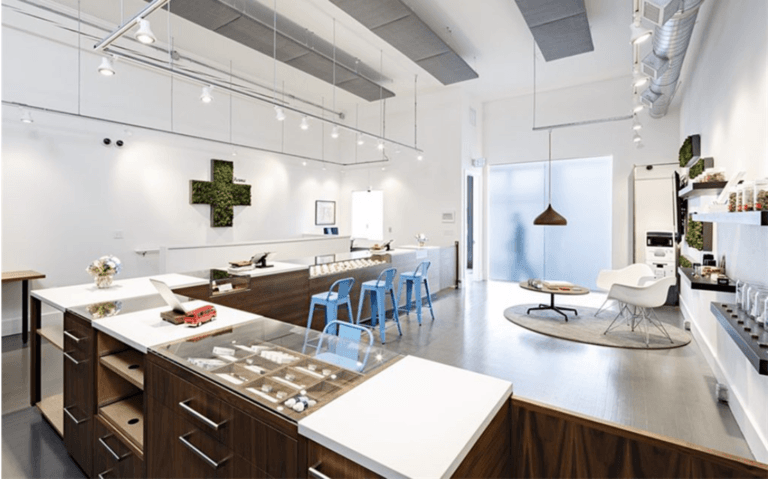
Serving both adult-use consumers and medical patients, Farma leans into the healthcare aspect by adopting clean white walls, smooth surfaces, and wall decorations that evoke medical imagery. Tweaking the medical formula, they also add a comfortable sitting area with a circular rug, blue bar chairs, and a lighting scheme that eliminates the cold anid sterile lighting of a hospital while still remaining well-lit.
The best way to craft an ambiance that matches your branding and customers is to devise design elements the stimulate the senses of sight, sound, touch, and smell. What kind of lighting and décor will you use? What type of sound do you want your customers to hear? Music? No Music? How will textures of the surfaces in your dispensary feel? Rugged or smooth? Will your store have a distinctive smell and if so, what kind of smell? Figure out how these senses relate to your brand and then lean into it with your dispensary design.
3. Strategically Use Digital Signage
This next dispensary design inspiration has less to do with aesthetics and more to do with utility. Some business owners are often tempted to saturate the sales floor with digital signs and menus as if they running a Burger King instead of a cannabis dispensary. While it may be tempting to put a few flat-screen TVs behind the counter and call it a day, you need to think about the customer’s journey and how your digital signage can help them along the way.
Most customers will feel awkward standing in front of a counter, looking anxiously as the menu board as the line starts to form behind them. Instead, try placing screens next to display products so that your customer can learn more about the product and feel less pressured to make a decision. A great example of a dispensary that uses their digital signage well is MedMen.
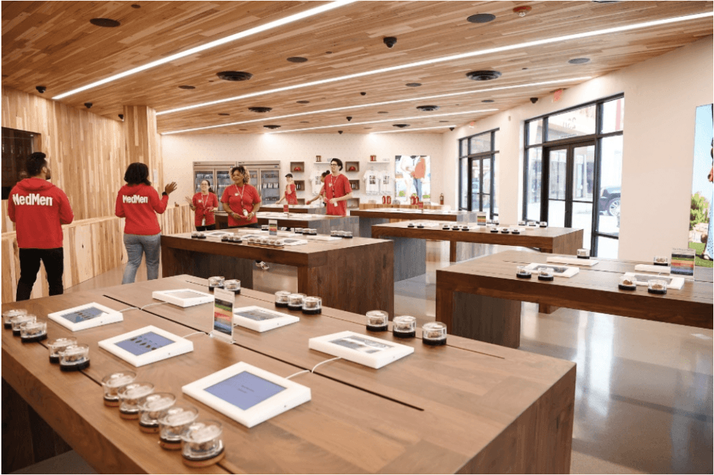
Instead of using gigantic LED screens, MedMen uses simple tablets placed next to product samples which allow customers to review information about each strain. They also have an employees walk customers through the process in case they have any questions. Think about where you can strategically place your digital signage and try leveraging your staff to help make the decision process easier for your customers.
4. Cut Down on Wait Times
Keeping the wait time down in your dispensary is vital. You might have the most beautiful dispensary in the world, but it won’t matter if it takes an absurd amount of time to make a transaction. Conversely, you don’t want your customers to feel like they’re being rushed out the door. What you need is to strike a balance between excellent service and fast service.
Going back to the previous example, a great way to reduce wait times is by using digital screens to display product information. Helping customers view product information before having to make a purchase will cut down on indecision and allow customers that already know what they want to make a decision. If you already have an established dispensary, watch the customer flow and look for chokepoints. Find out what’s slowing down customers, and work towards improving that experience.
If you’re having trouble getting the wait time down, try to find ways to keep customers busy while they wait. Create a sitting area with free wi-fi and a charging station or offer free refreshments (if state and local regulations permit). Here’s a good example of a waiting area:

This is from Nature’s Medicines in State College, Pennsylvania. Notice the area has comfy chairs, reading material, and a welcoming atmosphere. Think about how you as a customer would like your dispensary experience to be, and do your best to meet those needs.
5. Educate Your Customers
Some of your customers will be cannabis pros. But a fair number will be first-timers who feel overwhelmed by all of the choices. The best dispensaries will provide educational material so that their customers understand what they’re buying. Not everyone will know what CBDA is. Seeing that information explaining cannabinoids will put a lot of customers at ease. If you run a medical dispensary, it is even more important to have educational resources available.
An ambitious dispensary owner can create these materials themselves, or agencies like ours can help. Either way, there’s plenty of free resources online to help get you started. For example, the website Project CBD has free materials that you can printout for curious customers.

Some types of educational material that you might want to include are edibles dosing guides, the difference between THC and CBD, and the types of medical conditions that can be treated with cannabis.
6. Modular Shelving
One of the most important aspects of any dispensary is its shelves. Shelves are where you display your products, and they help add to the visual identity of your store. Stuck with limited space or a small budget? Figuring out how to set up your shelves can be a frustrating dilemma.
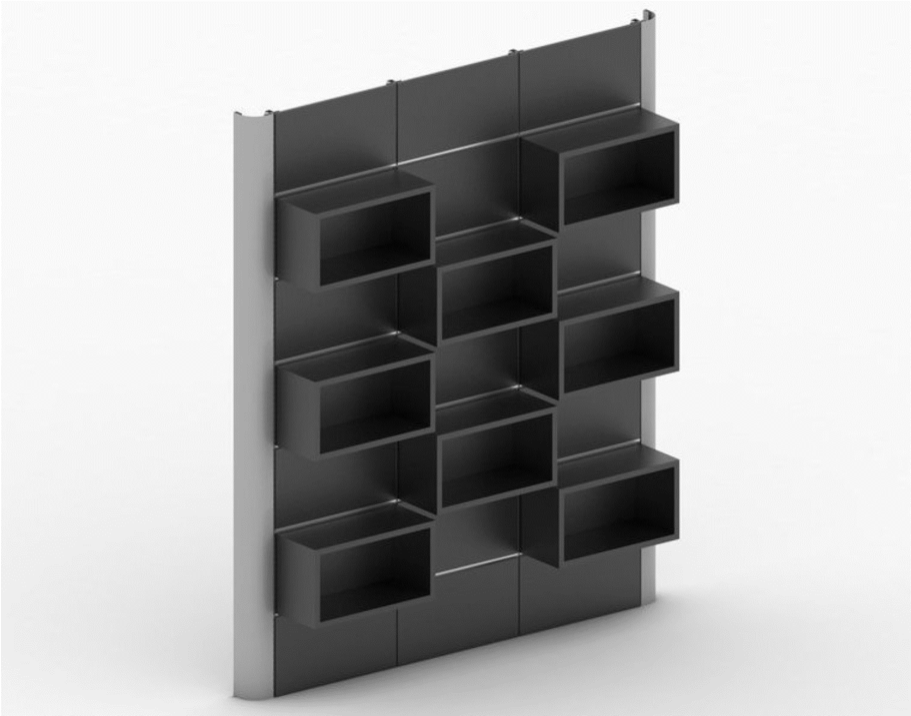
The simple solution to this issue is to invest in modular shelving. Modular shelves share vertical support, but they have adjustable shelf heights so that you can tweak your displays whenever you want. Some modular shelves are attached to the walls while others are freestanding. This flexibility allows you to mix and match, adjusting various shelf heights to draw attention to products that you want to highlight.
In addition to flexibility, modular shelves are often cheaper than traditional types of shelving, which is great for those that are on a limited budget.
The best dispensaries are not always the ones that spend millions of dollars on pricy art and fancy furniture. At the end of the day, good cannabis design boils down to the simple things, like setting an ambiance or giving your customers a place to wait. As long as you take care of the simple things while letting your brand speak for itself, there’s no reason why you can’t design an award-winning dispensary.


