From bowls that don’t break to bongs that roll up, buyers want smart cannabis designs. We’ve evolved past the apple bong to dual-action, customizable vapes and streamlined machines for at-home infusions. These are products that focus on functional design. That’s a term for products designed to efficiently and accurately deliver their user’s desired outcome.
Below are some guiding principles to consider when thinking about cannabis product design accompanied by a real-world functional design example.
Principles of Functional Cannabis Design
What a User Wants
It may seem obvious to think of the consumer first when designing, but when it comes to creativity, ego can sometimes get in the way. Yes, your product should look great and grab attention, but you don’t want that attention to come because a cool idea was more important to you than making sure your customers knew how to use your product. Think of the Delorean from the eighties. There’s a reason it’s not around today and only remembered for its part in Back to the Future. The doors lifted out and up, which in the creator’s probably coke-fuled design fog (it was 1980s, after all) seemed like a great idea, but in practice meant people couldn’t fit their bird winged cars into most parking spots.
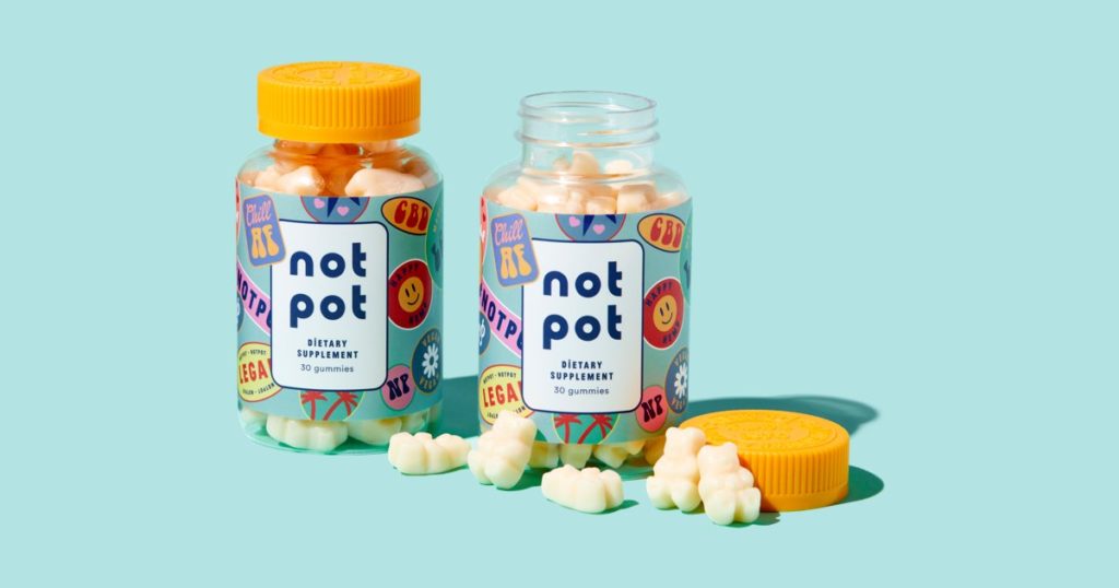
Not Pot goes back to the future with their contemporary take on retro designs. But what they’re more focused on is designing for consumers who may not feel comfortable with the idea of using pot. So the company behind the CBD gummies designed with that in mind, creating gummies that resemble vitamin chews in accessible packaging with fun and inviting imagery on their labels. Even the name Not Pot is an intentional choice. It cuts out any confusion so people can get right to what they want: a natural remedy that makes them feel good without getting high.
Match Outcome to Desired Effect
Think of your audience’s needs when designing your 420 accessories. They want something that’s easy to use and doesn’t take a lot of steps until they arrive at their desired outcome—whether it’s getting high, relieving stress, or however they use cannabis to treat themselves and practice self-care.
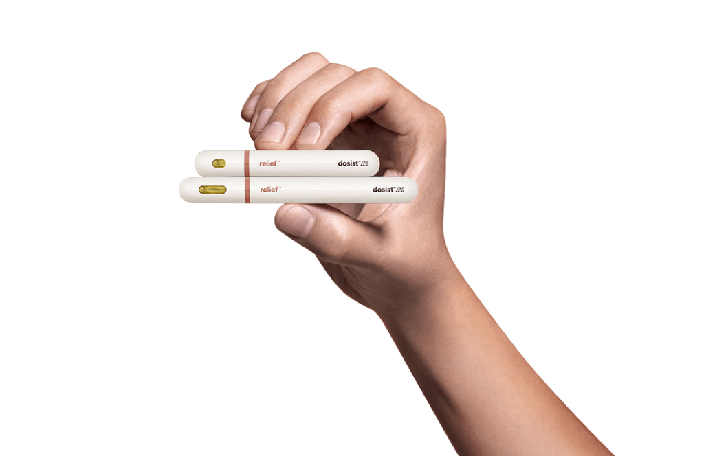
The people behind Dosist understand that the best products make it easy for customers. That’s why their products are simple to use. Dosist gives users a specific dosage in each pen for the effects they seek. Pens come in two dosage sizes and a menu of mood outcomes. The Bliss pen contains a ratio of 9:1 THC-to-CBD to give users a delightful head high. The Sleep pen contains an 8:1 THC-to-CBD ratio with support from soothing terpenes to relax users at the end of a long day. There’s no confusion about how to use the product and the focus is on the effects, not any bells and whistles.
Explain and Engage
Cannabis delivery systems and accessories should be easy to use and engaging to the user. Consider the functionality of your product and whether many different types of people will feel comfortable using it.
LEVO makes at-home infusions simple and fun. The LEVO II allows users to dry their own herbs in addition to infusing oil and butters. That’s an extra layer of engagement for folks who are already interested in having a more hands on experience with cannabis-infused food and skincare products. The control panel is easy to operate and gives users control over temperature and length of infusion. Rather than purchasing other infused products that may have solvents or additives, the DIY way means you know what’s going into your products. This is great for the at-home canna chef who wants that control but doesn’t want to make a mess grinding herb and manually putting it into their butter.
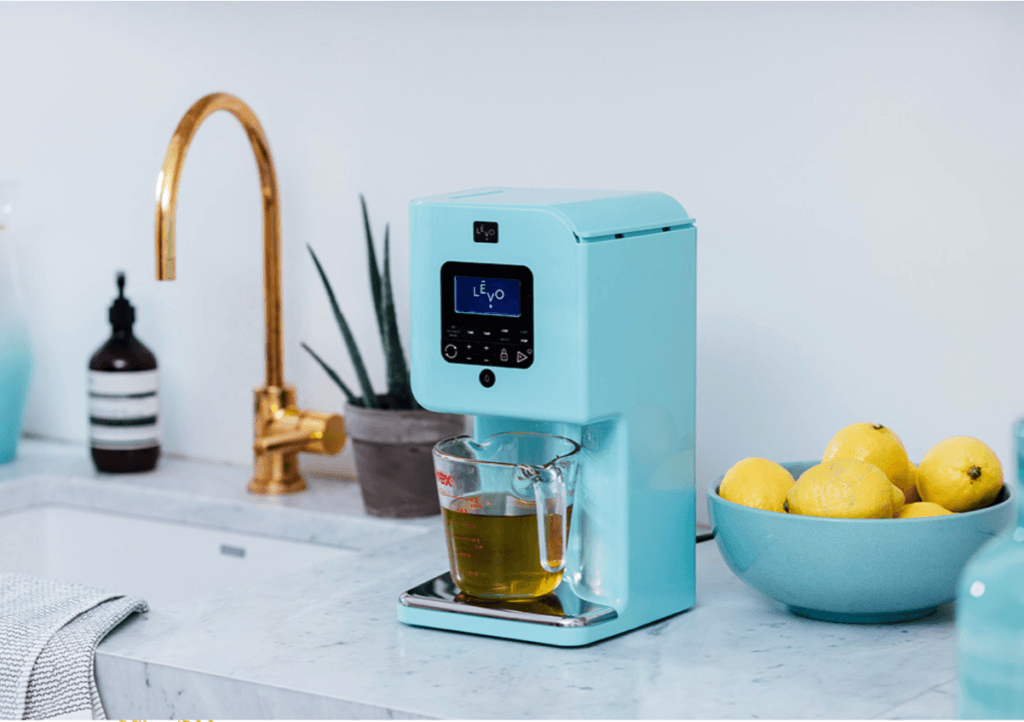
Additionally, the machine doesn’t have to be used for cannabis. In fact, LEVO’s site doesn’t mention what type of herb they think their customers should use. This gives the company a lot of freedom (no checking age at the website landing page; no stigma to overcome), and means that anyone can feel comfortable using their product. Your mom can make her herbed butter. And after the detachable pieces take a trip through the dishwasher, you can make your “herb” butter.
But Does it Work?
How well-designed it looks and what effects a cannabis accessory provides is important. But equally important is users having clear feedback to know the product is functioning correctly. There should never be a mystery surrounding product usability. Users should have a clear indication that their product is doing what the packaging says it will.
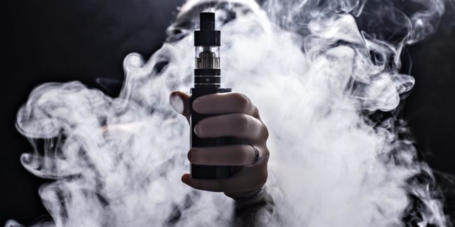
VapeDynamics makes the Hera 2 Vaporizer, which features a ceramic and stainless steel dual-chamber that allows for users to switch between flower and extracts. This provides users with options without having to switch between products. The touchscreen controls are very user-friendly: they have options for switching between dry herb and concentrate, as well as control of the temperature. Lights on the side turn on one at a time to show when the vaporizer is heating up, and once all five lights are on, they turn blue to signify that it’s time to fly. The vaporizer sends signals via small vibrations, a haptic feedback feature that completes the product’s constant communication with its user.
The best designers understand that function is as important as form. By following a few simple design concepts, cannabis companies will ensure that their functional design gives users what they want in a quick and clear way.
